Lessons learned from a design system that was never built
Summary
A design system is a collection of reusable components that can be put together to design and develop any number of products. Creating one is a joint effort between product design and Engineering. Agreeing on the best way to work together takes time, and the many different technical approaches make it tricky to see the right decisions in advance.
The ingredients needed to develop a successful design system are:
- A dedicated team to build and maintain it
- Clear communication between product design and engineering
- Senior stakeholder and company-wide buy-in
Goal
Design and develop a system of reusable components
Hypotheses
A design system will reduce the time it takes to design and develop products
Introduction and context
Design systems follow a similar approach creating U.I. parts (or components) that are reused. The methodology I followed was Atomic Design by Brad Frost. Atomic Design involves breaking an application down into its basic components (atoms, molecules and organisms) and then working up to create a complete system. The typeface, colour and grid are the basic parts of the system; the atoms.
Engineering used vanilla material design web components directly and customised them. Clear communication between product design and engineering is necessary at this early stage.
Other influential frameworks are; Google and Carbon from IBM. NNgroup, Apple human interface guidelines and Microsoft design principles were also a big source of inspiration when it came to writing a rationale and explaining how to use each component.
An example of a network, the product's structure is an atom; it cannot be broken down into simpler parts
Start with a standardised approach to creating components
I started with a button, believing it was the smallest atom (most basic part) I could create. I realised later it’s not; a button is probably the most common component in most U.I.s but not the most basic; you can break a button-down into simpler parts.
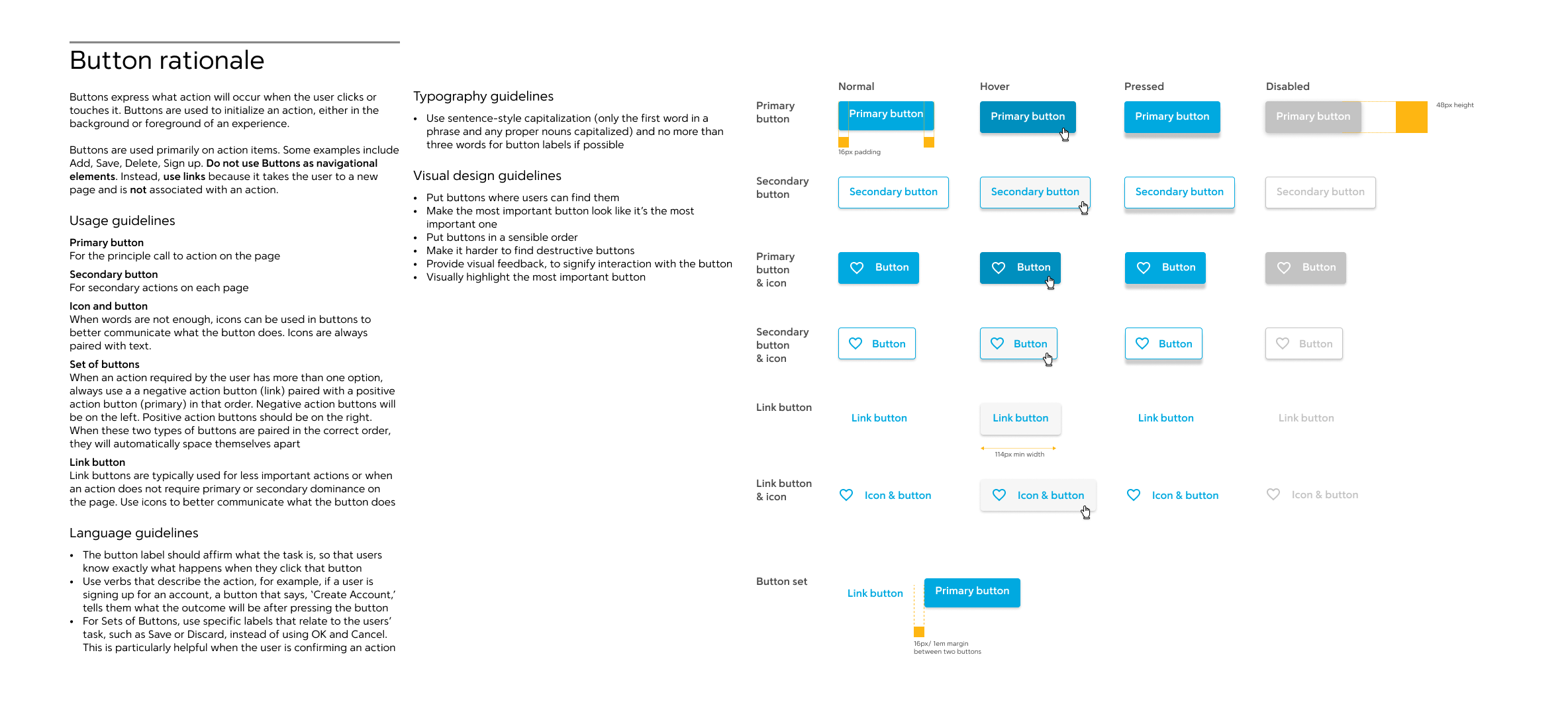
Example of a buttons rationale
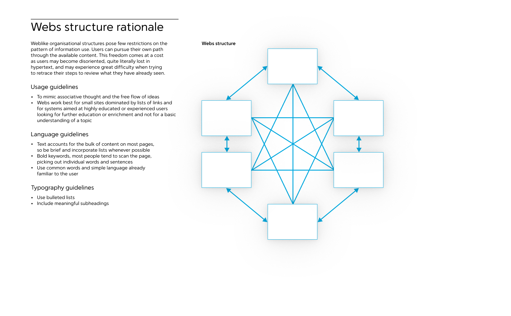
Before creating anything at all, start by defining a standard approach to designing components.
-
A component rationale. Define why components exist, what needs they fulfil -
Usage guidelines. Define how to use components in applications -
Typography guidelines. Explain and show examples of how to set type -
Language guidelines. Consider the tone of voice, decide on a language style, e.g. sentence case, or title case -
Visual design guidelines. Explain where components appear on a screen. Define different component states, e.g. hover, pressed, normal and selected. Think about dimensions and spacing
Some components will need extra guidelines, but they all should have these five elements defined. All team members should agree on the rationale and usage guidelines. Documentation and standards are what separates good design systems from average.
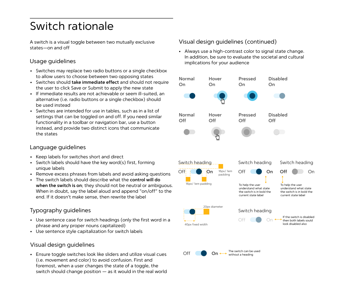
A switch component and rationale
Stakeholders and team members need to 'see' the design system
We decided to use Fractal for this job. Fractal is a framework used to build and document components. It’s a type of style guide so anyone could view the design system in a browser. Many advantages to using Fractal:
- Shareable and viewable by stakeholders and team members
- A single source of truth
- Fractal is a technology agnostic style guide, meaning an application can be developed using any library
Disadvantages:
- There was a duplication of effort e.g HTML, CSS, Javascript developed for Fractal could not be reused in applications
- Using Fractal meant adding complexity to the development process, as it depended on libraries
Using Fractal ended up being a problem. On the one hand, we had practical and realist engineering issues trying to develop a style guide. On the other hand, designers, product managers and stakeholders needed to see the components. We also needed a single source of truth to show how the components looked and behaved in a browser. It would have been faster not to use Fractal and instead use a web page to reference the components.
It takes time to develop and maintain a style guide that everyone can see. We did not have enough time to do this work as part of a regular sprint. This is one reason why a design system is a product and should be treated like one.

Typographic scale and rationale
Problems using material design web components
Using material design web components speeded up development as we didn’t have to build each component from scratch. We customised the web components to get our look and feel. But we had a few issues with this approach; mainly, material design components are not well documented; meaning they don’t work predictably. Which, resulted in trouble getting material design web components to work the way we wanted. Overriding some material design classes is not easy. We also had issues with Fractal understanding the material web design components.
Stakeholders buy-in
Senior stakeholders, product owners and the organisation must understand the value of a design system and care that it succeeds. Only one product was used to drive all the requirements for the design system. Which resulted in a lot of extra work per sprint, which was hard to justify. The product owners priority was their product road map, and a design system had limited business value.
It took a large amount of effort to develop and maintain components, and there was not enough time to do this work as part of a regular sprint. Another reason why a design system is a product and should be treated like one.

An example of a sequential structure, the product's structure is an atom; it cannot be broken down into simpler parts
Outcomes and results
Even though the design system did not get built, it was a valuable learning experience.
-
Products come first. They have to exist before the design system. I planned to use products to drive requirements for components. The product was cancelled, and the need for the design system when away -
A style guide is necessary. So stakeholders can see the design system. It also needs to be easy for engineering to maintain and develop -
Product design and engineering have to create a design system together. A design system that only exists in Figma will never be used or referenced by the organisation -
Rationale and documentation of each component are essential. It’s the only way team members will use them consistently across different products -
Engineering needs to be part of the design process. -
Start with a link , define font scale and colour, do not start with a button