Why were customers not using our product's latest feature?
Summary
The product had a limited number of features when developed first. But over time extra functionality was added without an overall plan, this led to features being placed in unsuitable areas, making them difficult for users to
This was obvious by looking at the analytics of the latest feature 'App Control', we could see that they were not clicking on the correct tab.
Goal
Increase usage of the new 'App Control' feature
Hypotheses
Users are not using the 'App Control' feature because they can not find it
Introduction and context
Users were not clicking on the right part of the U.I. I did not understand why. To find out, I ran a usability test, I gave users a task and observed them completing it.
Test results highlighted two main problems:
-
The content was poorly organised it took too long for users to find what they were searching for and -
Category labels were not meaningful or distinct. They did not create enough context for users to understand the product

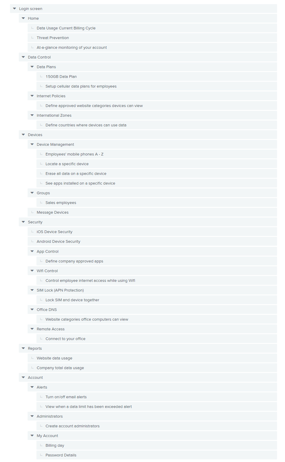
The product's information architecture before being reorganised
Solving the problem
The problems were clear: users could
The solution was to organise the product so that it made sense to users. Or to say it another way the information architecture had to improve.
Information architecture is the design of information environments; organising and labelling software to support usability and findability. I adopted two methods to improve the I.A.

Card sorting is a UX research technique in which users organise content into groups. Photo by UX Indonesia on Unsplash
Use card sorting to organise related concepts
If users can
The team wrote down on cards all the concepts and functionality within our system in plain English (roughly 25 cards). I asked users and key stakeholders to organise the cards into groups that made sense to them. I then asked them to label each of the groups they had created.
Where possible we did this in a room together to hear
Use tree testing to measure the findability of topics
Once card sorting was complete I had the basic structure of the system. Then I tested if the structure made sense to users; can they
Tree testing is a technique that can answer these questions. It involves writing very simple, realistic tasks. Presenting the tasks to users and measuring whether they
A text-based version of the product's information architecture tree. This is what users saw when completing tasks
Tree testing results
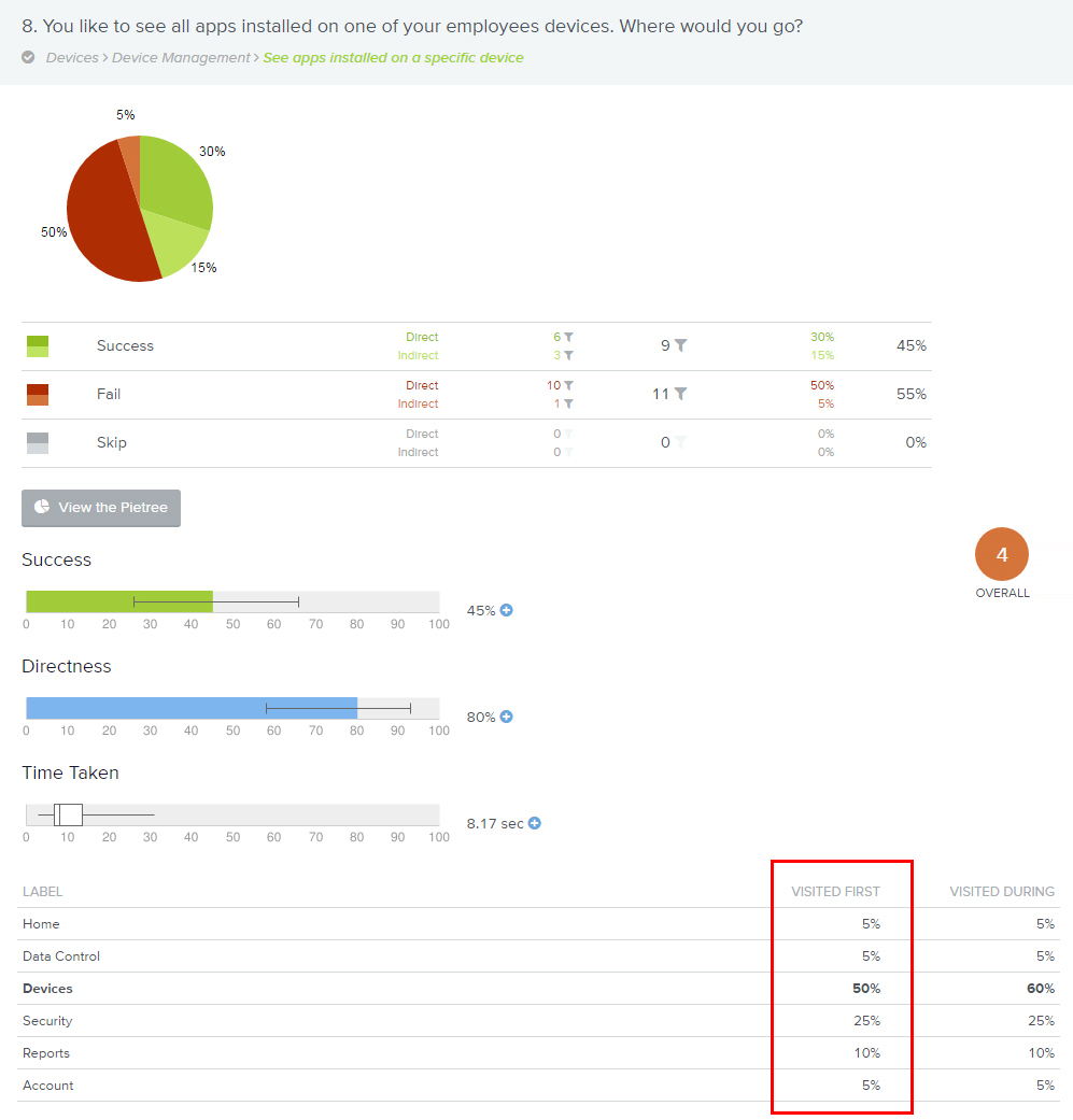
Metrics from the tree testing, the task users were asked to complete can be seen at the top in the light blue box
Above, you can see an example of how all users performed on a task. Highlighted 'First Click' or 'Visited First' is one of the most interesting metrics because it is a good indicator of the suitability of the category label. Based on the results, there were some iterations of the category labels and reorganising the grouping of content within the tree. This process was repeated until I was satisfied that all the key tasks were quickly and accurately completed.
Visual design and retesting
Once the information architecture tree was finished it was time to start the visual design. I created a prototype that matched as closely as possible the final look and feel of the product. Using the same tasks and metrics, I tested the prototype again to establish if there has been an increase or decrease in findability.
.jpg)

The product's information architecture after being reorganised
There were big improvements in
Outcomes and results
Reorganising the information architecture was a big undertaking but was worth the effort:
- The Time to find the new feature 'App Control' improved by 97% (from 5m 40s average to 10s)
- The system was now based on the users' tasks and used labels for categories that were already familiar to them. This led to significant usability improvement
- I accomplished my goal by restructuring the system and improving the information architecture. Usage of the 'App Control' feature increased
- Stakeholders were part of the process, and evidence from testing helped convince the development team to refactor the whole product