Never enough data: how dispatchers and planners really work
Summary
I ran a series of field visits and remote sessions with 5 enterprise customers across Europe to gather early feedback on SCALAR, ZF Transics' rebuilt fleet management platform. It was the first time these customers had seen the new software. The sessions combined structured workshop discussion with informal usability observation. The findings surfaced two significant gaps, a lack of data density and no support for role-based personalisation, which led directly to a redesign of SCALAR's main live view product and updates to the platform's design system.
Goals
- Gather first-impression feedback on the new SCALAR platform from existing enterprise customers
- Identify pain points in core daily workflows through observation and structured discussion
Introduction and context
SCALAR is ZF Transics' fleet management platform, used by the logistics and transport industry to manage large fleets. The platform had been significantly rebuilt, and these sessions represented the first opportunity for customers to see and interact with the new software.
I visited 5 customers across Europe and ran additional remote sessions, using a workshop format that encouraged open discussion while allowing me to observe how users naturally used the interface. Because it was their first time seeing the platform, I was listening both for explicit feedback and for the underlying workflow needs that the product would need to support.
What customers told us
A consistent picture emerged across all 5 customers. Most had at least 2 monitors, their TMS on one screen, telematics software on the other. SCALAR's tab-switching added a further layer of context-switching on top of an already fragmented workflow. Users were spending significant time switching between tabs and screens just to get a complete view of their fleet. Within SCALAR's live view specifically, every customer raised the same issue: they couldn't see enough vehicles at once. The current list-based layout meant too much scrolling and switching, too many clicks to see relevant data, and too little screen space being used effectively.
The second theme was about personalisation. Different roles, dispatchers, planners, fleet managers, need different information depending on their tasks. The platform wasn't distinguishing between them. Users wanted to be able to tailor what they saw on screen to match the decisions they were making during the day.
What the data confirmed
The qualitative findings were reinforced by platform usage data. More than 76% of user sessions took place on desktop, with typical session lengths of 15 to 17 minutes the profile of someone working through a task, not glancing at a dashboard. Versus under 1 minute on mobile, this confirmed that SCALAR's primary use case was desktop-first, task-focused, data-heavy work, and that the interface needed to be designed for that reality rather than defaulting to a mobile-first approach.
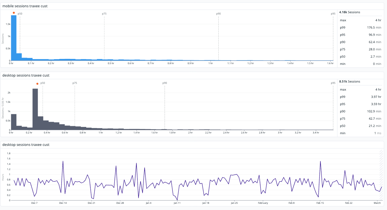
Datadog RUM
Recommendations
I presented the findings to senior stakeholders alongside two recommendations:
- A data-rich interface move away from the current list layout toward a denser, table-based design that makes better use of available screen space, reduces the number of clicks needed to find information, and allows users to act on data rather than search for it.
- Per-role personalisation giving users the ability to configure what they see based on their role and daily workflow, reducing context switching and making SCALAR the system they return to rather than work around. Both recommendations were grounded in direct customer evidence and supported by the usage data.
Outcomes and results
The research directly shaped two product decisions.
SCALAR's live view, the most used screen in the platform, was redesigned with both themes at its centre: a denser layout, tabbed navigation by asset type, and configurable views by role. The findings also prompted a broader shift in how teams think about the customer.
Updates across the Velocity design system; components, patterns, and documentation to support a data rich UI. Reinforcing that SCALAR's primary customer segment are enterprise customers managing large fleets, and that the platform needs to meet the demands of that context, not a simplified or mobile-optimised version of it.